Purpose
This vignette demonstrates how to load the package datasets and perform quick checks to confirm the structure and content. It uses concise, reproducible examples you can adapt for exploratory work and quality control.
What’s inside:
- Data access. Load sim_monthly, sim_weekly, and sim_daily and verify they are present.
- Review structure. Print concise schema for each dataset.
- Quick visuals and summaries. A monthly trend line.
- Tooling notes. Short explanations of the build and development libraries.
Data Access
#load the datasets from the installed package during vignette build
if (!requireNamespace("yusufHAIGermany", quietly = TRUE)) {
  stop("Package not available in vignette build process.")
}

data("sim_monthly", package = "yusufHAIGermany")
data("sim_weekly",  package = "yusufHAIGermany")
data("sim_daily",   package = "yusufHAIGermany")

#quick sanity check so the build fails early if something is missing
stopifnot(
  exists("sim_monthly"), exists("sim_weekly"), exists("sim_daily")
)
The package provides three simulation tables for HAIs in Germany (2011 – 2012) and was cleaned to get these formats:
sim_monthly: date, year, month, hai, region, sex, cases_month, deaths_month, dalys_month.
sim_weekly: date, year, iso_week, hai, region, sex, cases_week, deaths_week, dalys_week.
sim_daily: date, year, yday, wday, hai, region, sex, cases_day, deaths_day, dalys_day.
For details on the data source and variable definitions, see the Data Description, and the examples of common analysis steps are provided in the Examples.
Review Data
This glimpse() function helps understand the data type and its appearance, making the process easier for IDA and EDA.
Quick Visualisation and Summaries
hese are the example tables and figures that can be used to start analysing the data:
Summary table by year, region, metric, and HAI
# HAI categories
hai_levels <- sort(unique(sim_monthly$hai))

# Build table for each metric
summary_region <- sim_monthly |>
  group_by(year, region, hai) |>
  summarise(
    cases  = sum(cases_month),
    deaths = sum(deaths_month),
    dalys  = sum(dalys_month),
    .groups = "drop"
  ) |>
  pivot_longer(cols = c(cases, deaths, dalys),
               names_to = "metric",
               values_to = "value") |>
  pivot_wider(
    names_from = hai,
    values_from = value,
    values_fill = 0
  ) |>
  arrange(year, region, metric)

knitr::kable(
  summary_region,
  caption = "Summary by year, region, and metric, with HAI categories as columns."
)| year | region | metric | HAP | SSI | BSI | UTI | CDI |
|---|---|---|---|---|---|---|---|
| 2011 | EU/EEA | cases | 119573.0 | 100961.0 | 29548.0 | 250172.0 | 39626.0 |
| 2011 | EU/EEA | dalys | 77966.6 | 31368.3 | 63903.3 | 77783.5 | 23021.2 |
| 2011 | EU/EEA | deaths | 4453.0 | 2532.0 | 4277.0 | 4274.0 | 2114.0 |
| 2011 | Germany | cases | 108704.0 | 91784.0 | 26861.0 | 227429.0 | 36030.0 |
| 2011 | Germany | dalys | 70878.6 | 28516.5 | 58093.8 | 70712.2 | 20928.6 |
| 2011 | Germany | deaths | 4047.0 | 2301.0 | 3887.0 | 3885.0 | 1922.0 |
| 2012 | EU/EEA | cases | 117743.0 | 98488.0 | 30212.0 | 244976.0 | 41294.0 |
| 2012 | EU/EEA | dalys | 76615.2 | 30402.3 | 65402.9 | 76522.7 | 23983.4 |
| 2012 | EU/EEA | deaths | 4371.0 | 2454.0 | 4378.0 | 4203.0 | 2202.0 |
| 2012 | Germany | cases | 107039.0 | 89535.0 | 27465.0 | 222706.0 | 37540.0 |
| 2012 | Germany | dalys | 69650.1 | 27638.5 | 59457.3 | 69566.0 | 21802.4 |
| 2012 | Germany | deaths | 3975.0 | 2230.0 | 3979.0 | 3821.0 | 1998.0 |
According to Table 1, Germany consistently reports higher case counts than the overall EU/EEA, with UTI and HAP making up the largest portions in both years. DALYs follow a similar pattern, showing that the burden is driven by both frequency and severity in these categories. Deaths remain significantly lower across all groups, but the distribution across HAI types reflects the same patterns seen in cases and DALYs.
summary_sex <- sim_monthly |>
  group_by(year, sex, hai) |>
  summarise(
    cases  = sum(cases_month),
    deaths = sum(deaths_month),
    dalys  = sum(dalys_month),
    .groups = "drop"
  ) |>
  pivot_longer(cols = c(cases, deaths, dalys),
               names_to = "metric",
               values_to = "value") |>
  pivot_wider(
    names_from = hai,
    values_from = value,
    values_fill = 0
  ) |>
  arrange(year, sex, metric)

knitr::kable(
  summary_sex,
  caption = "Summary by year, sex, and metric, with HAI categories as columns."
)| year | sex | metric | HAP | SSI | BSI | UTI | CDI |
|---|---|---|---|---|---|---|---|
| 2011 | Female | cases | 102726.0 | 77099.0 | 23691.0 | 229247.0 | 37828.0 |
| 2011 | Female | dalys | 66980.3 | 23953.7 | 51238.7 | 71277.7 | 21974.9 |
| 2011 | Female | deaths | 3826.0 | 1932.0 | 3429.0 | 3915.0 | 2018.0 |
| 2011 | Male | cases | 125551.0 | 115646.0 | 32718.0 | 248354.0 | 37828.0 |
| 2011 | Male | dalys | 81864.9 | 35931.1 | 70758.4 | 77218.0 | 21974.9 |
| 2011 | Male | deaths | 4674.0 | 2901.0 | 4735.0 | 4244.0 | 2018.0 |
| 2012 | Female | cases | 101152.0 | 75210.0 | 24223.0 | 224487.0 | 39417.0 |
| 2012 | Female | dalys | 65819.3 | 23216.3 | 52441.0 | 70122.6 | 22892.9 |
| 2012 | Female | deaths | 3756.0 | 1875.0 | 3510.0 | 3854.0 | 2100.0 |
| 2012 | Male | cases | 123630.0 | 112813.0 | 33454.0 | 243195.0 | 39417.0 |
| 2012 | Male | dalys | 80446.0 | 34824.5 | 72419.2 | 75966.1 | 22892.9 |
| 2012 | Male | deaths | 4590.0 | 2809.0 | 4847.0 | 4170.0 | 2100.0 |
According to Table 2, male patients consistently show higher case counts and DALYs across all HAI categories, reflecting a greater infection burden compared with females in both years. The distribution across HAP, SSI, BSI, UTI, and CDI remains stable between sexes, indicating similar clinical patterns despite differences in overall magnitude. Deaths follow the same trend, with male totals slightly exceeding female totals across all HAI types.
Monthly Total HAI cases with Composition by Infection
monthly_totals <- sim_monthly |>
  dplyr::group_by(date) |>
  dplyr::summarise(total_cases = sum(cases_month), .groups = "drop")

monthly_mix <- sim_monthly |>
  dplyr::group_by(date, hai) |>
  dplyr::summarise(cases = sum(cases_month), .groups = "drop")

peak_pt <- monthly_totals |> dplyr::slice_max(total_cases, n = 1)

ggplot() +
  geom_area(data = monthly_mix,
            aes(x = as.Date(date), y = cases, fill = hai), alpha = 0.75) +
  geom_line(data = monthly_totals,
            aes(x = as.Date(date), y = total_cases), linewidth = 1.1) +
  geom_point(data = peak_pt,
             aes(x = as.Date(date), y = total_cases), size = 2) +
  geom_text(data = peak_pt,
            aes(x = as.Date(date), y = total_cases,
                label = scales::comma(total_cases)),
            vjust = -0.5, size = 3.2) +
  scale_y_continuous(labels = scales::label_comma()) +
  labs(x = "Date", y = "Cases (monthly)",
       fill = "Infection type",
       title = "Monthly HAI burden: Total and Composition") +
  theme_minimal(base_size = 12) +
  theme(plot.title = element_text(face = "bold"),
        legend.position = "bottom")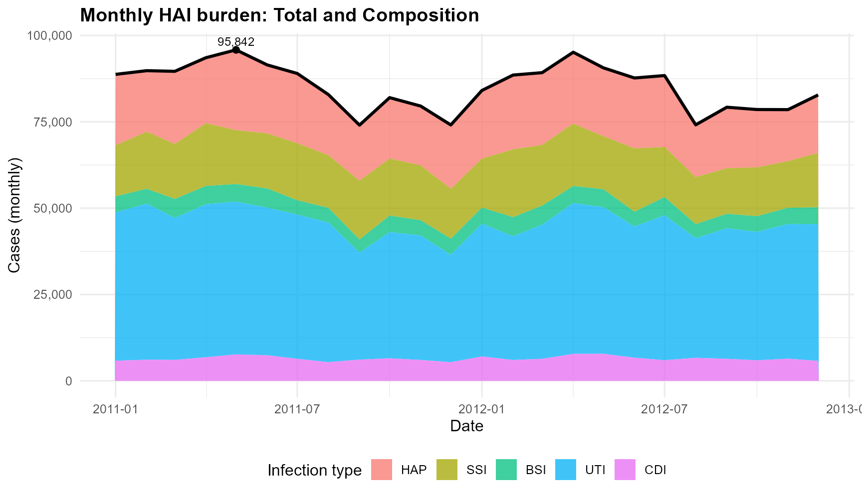
Monthly total HAI cases with composition by infection type, 2011–2012
According to the Figure 1, the total HAI cases remained high throughout 2011 – 2012, with a noticeable peak in mid-2011. UTI consistently made up the largest share of the monthly burden, while CDI contributed the smallest proportion. The overall pattern remains stable, with seasonal increases and decreases that seem consistent across infection types.
For more information regarding the analysis, please check the live Shiny dashboard App and Examples.
Tooling Notes
This package is:
Built with:
- shiny and bslib: UI components and theming for interactive apps.
- ggplot2 and plotly: Static and interactive charts for EDA and review.
- dplyr, tidyr, lubridate, scales, glue: Data wrangling, date handling, formatting, and text utilities.
- yusufHAIGermany: Package datasets and helpers.
Developed with:
- devtools, usethis: Package scaffolding, workflow, and checks.
- roxygen2: In-source documentation and NAMESPACE generation.
- pkgdown: Static documentation site for functions, articles, and examples.
- knitr, rmarkdown: Reproducible vignettes and literate programming.
- rsconnect: Deployment to shinyapps.io.